
It's Friday and time for another Fix It Friday project from iHeartFaces. This week's photo belongs to Jen from My Mindless Musings. Make sure to check out all the different "fixes" that so may different people have posted. It is so neat to see one photo in so many different and unique ways. It is amazing how many possibilities are available for one photo with a little post processing. I am new to post-editing and use PSE 5 - which sometime frustrates the daylights out of me...but these little weekly projects are teaching me so much!
Here is the original image (SOOC)
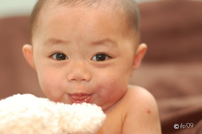
Here are my fixes:
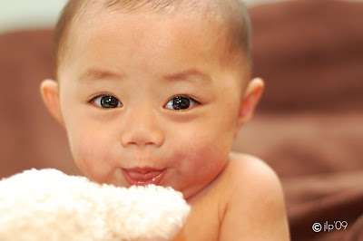 For this first one, I used the clone stamp & healing brush to fix a few blemishes. I lightened things up a bit. Sharpened the eyes using the lasso & unsharp mask. Applied an overlay layer & reduced the opacity. This gave me my slate for the next 3 images.
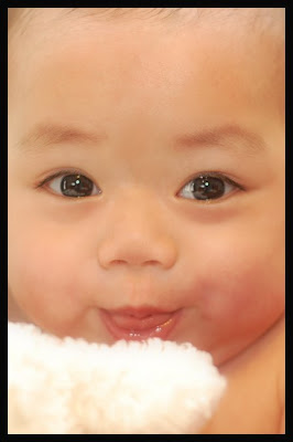
For this second one, I added a Gaussian Blur layer and adjusted the opacity. Then cropped and added a border.
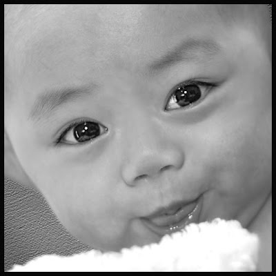
For the third image, I changed to B&W. Then I added a background texture. I erased the areas I did not want texturized (thanks to last week's tutorial). Then cropped & added a border.
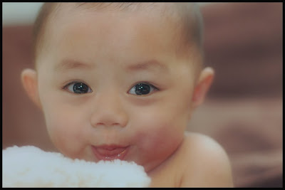
Finally, in this last image, I don't even remember all of the steps. I stepped outside of the things I know how to do & played with some layers that I haven't fiddled with before. One of them was difference (all black) & adjusted opacity. The final thing layer was High Pass. I also adjusted the opacity. Finally, a crop & a border. I like the soft look to this one.
So, what do you think of my fixes? Constructive criticism always welcome! All of the borders mentioned above are black, therefore not showing up...mental notes to self - no more black borders for the blog. And be sure to check out all of the other edits that have been posted at iHeartFaces.


3 comments:
Great job on the fixes and the textured background!
Aren't textures so cool! It was really ironic that Angie asked me to write a tutorial when I didn't even know how to do textures until I read Gina's tutorial. :) That's the neat thing about it...it's easy to pick up and adds so much to the picture!
I really like you first picture the best even though the other ones are really neat too. I think in the first one, you took care of all the slight issues (scratches, skin blotches). The changes are slight, but it makes all the difference. Goes to show that a light hand can make a beautiful photo just that much better!
BTW, you commented on my site that you liked the texture I used. I can't figure out where I found it. I do have it saved on my computer if you'd like me to send it to you. Just e-mail me if you want it, and I'll send it to you. (mriley1 [at] neo.rr.com)
Post a Comment