 It's Friday and time for Fix It Friday over at iHeartFaces.This week's photo is of an adorable and tiny little munchkin! It's called Cooing Baby. I mostly used PSE 5.0, but I pulled one into Picnik to add a vignette. I also created a collage in Picnik with some of the images since I did so many fixes this week.
Here is the original photo. As you can see, the baby is adorable to begin with.
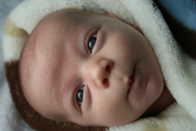 Here is my first fix that I then used as my base for all of the other. I fixed a few baby blemishes and adjusted the overall skin tone (thanks to this week's tutorial). I also rotated the image for the simple reason that I just didn't like it's original orientation. The final fix for my base was a little dodging on the darkest part of the blanket...it seemed a bit too dark to me.
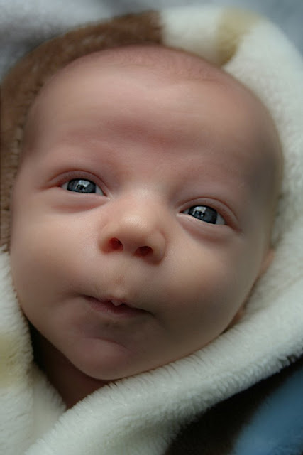 Other Fixes:
For these two, I rotated the image back to its original orientation. I then stretched the images so that I could crop and then rotate the crop a little bit so that the baby seemed a little more natural to me on its side. The second one was pulled into Picnik where I added a boost and a vignette.
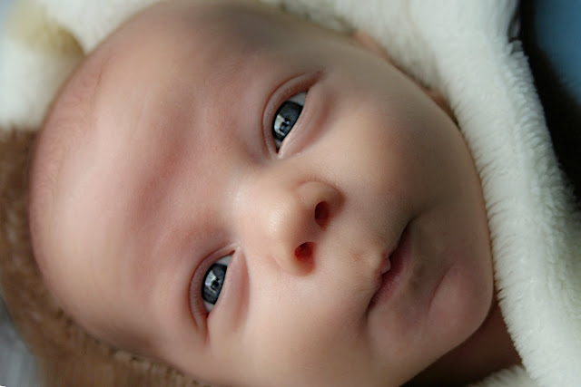
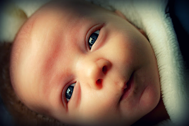 The rest:
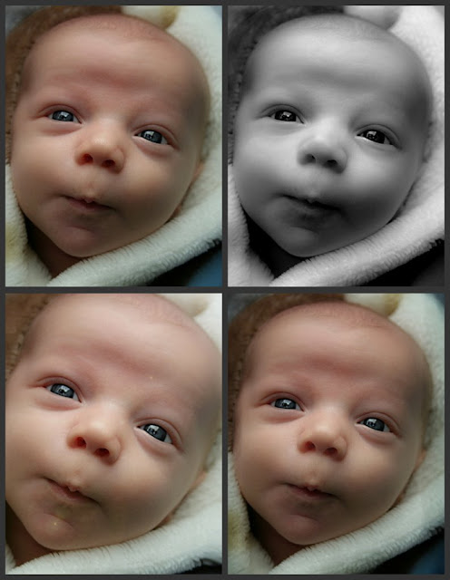 These four were all edited in PSE 5.0. I only used Picnik for the collage.
Top Left: Very close to the first fix. Minor level adjustments and a soft light overlay.
Top Right: B&W conversion. I adjusted the contrast and then had to go back and reduce the "shiny" areas.
Bottom Left: Cropped and titled. Then I added a lens flare and lightened it a little. I think that one is my favorite.
Bottom Right: Again, similar to the first (base) fix. For this one, the only thing added was that I burnt the edges a little.
I tried some backgrounds and textures this week too, but I wasn't happy with them. Hope you like these.


13 comments:
I love how his eyes pop!! You did a great job and I like the vignette you did also. It give the photo a nice change.
Great collage! Nice work!
They look awesome! Good job!
Very beautiful. I love how you fixed the skin, but it doesn't look fake at all. I'm with you, I love the bottom left one the best. The orientation of the original picture bothered me too. Lengthening the blanket really seemed to help it look more natural. I enjoyed your edits!
Oh, I also wanted to ask whether you've tried the Coffeeshop actions. It uses the same process Rita explained in the tutorial, but also adds some other easy fixes. (Makes it go much quicker.) I think Rita has a vignette action too, which would cut down on editing time. (not having to put the photo into a different program) If you can't tell, I LOVE her actions. :)
nice work! I did lots of edits too - I posted 6, but there were more along the road!! It was a good pic to work with wasn't it :)
I think upping the exposure worked well in his eyes. He's a sweetie, isn't he? And you did great with your various edits. I only had time/creativity for one!! Haha!
Very sweet edits. The picture has a nice softness about it now! :)
I love he first edit. Great job with the skin! I really need to learn how to do that in GIMP.
I absolutely love your first edit. it is so natural and does not look overdone in the least bit!!
I really love the soft look you gave to the photo.
Nice fixes. I like the second one the best - it seemed the most natural. I love how clear you got his skin.
I love all of your fixes. I love seeing how many different things you can come up with... amazing
Post a Comment