It's Friday and time for Fix It Friday over at
iHeartFaces.This week's photo is of an adorable and tiny little munchkin! It's called Cooing Baby. I mostly used PSE 5.0, but I pulled one into
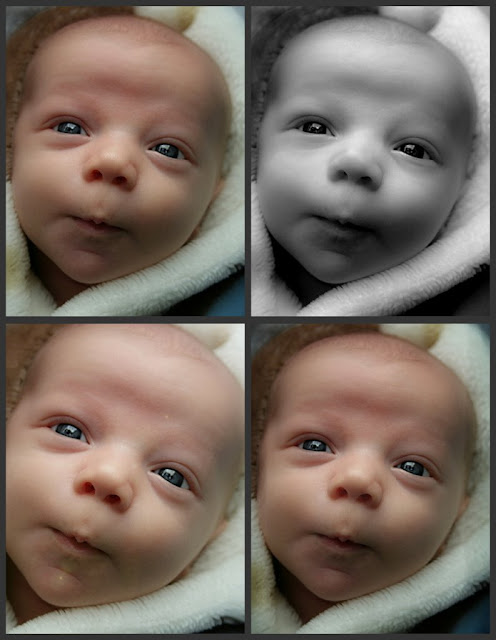
Picnik to add a vignette. I also created a collage in Picnik with some of the images since I did so many fixes this week.
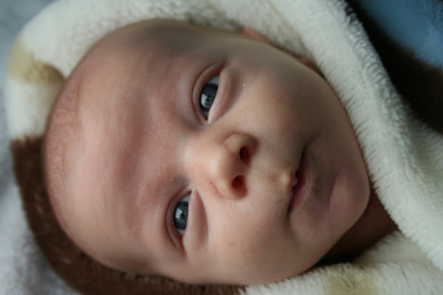
Here is the original photo. As you can see, the baby is adorable to begin with.

Here is my first fix that I then used as my base for all of the other. I fixed a few baby blemishes and adjusted the overall skin tone (thanks to this week's
tutorial). I also rotated the image for the simple reason that I just didn't like it's original orientation. The final fix for my base was a little dodging on the darkest part of the blanket...it seemed a bit too dark to me.

Other Fixes:
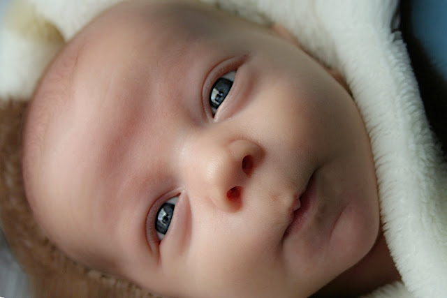
For these two, I rotated the image back to its original orientation. I then stretched the images so that I could crop and then rotate the crop a little bit so that the baby seemed a little more natural to me on its side. The second one was pulled into Picnik where I added a boost and a vignette.


The rest:

These four were all edited in PSE 5.0. I only used Picnik for the collage.
Top Left: Very close to the first fix. Minor level adjustments and a soft light overlay.
Top Right: B&W conversion. I adjusted the contrast and then had to go back and reduce the "shiny" areas.
Bottom Left: Cropped and titled. Then I added a lens flare and lightened it a little. I think that one is my favorite.
Bottom Right: Again, similar to the first (base) fix. For this one, the only thing added was that I burnt the edges a little.
I tried some backgrounds and textures this week too, but I wasn't happy with them. Hope you like these.
 Yep...I am quite sure many of you love this fruit...but for me, I could do without it. With the exception of photographing it, I stay as far away as possible. Not only does it make my tongue and throat itch, the blooming tree make me miserable! But I can admit they are beautiful!


